
Imagine walking into a massive library, only to find that thousands of books are scattered aimlessly with no proper categorization. You’d likely feel overwhelmed and frustrated trying to find the information you need. The same scenario applies to your website — without an SEO-friendly navigation structure, visitors would struggle to explore your site and easily access your content. In this blog post, we’ll dive into the most effective strategies for crafting a user- and search engine-friendly website navigation that can lead to increased organic traffic, improved user engagement, and ultimately, higher conversions. Say goodbye to those messy libraries and let’s create a website that’s easy for both users and Google to navigate!
There are several things you can do to create SEO-friendly navigation on your website. These include organizing your content into categories and subcategories, using descriptive and concise labels for menu items, avoiding format-based navigation such as dropdown menus or flyouts, limiting the number of menu and submenu options, linking to strategic pages from the main navigation bar, ensuring that compliant indexable pages are only a few clicks away from the homepage, and cross-linking pages within silos. Additionally, it’s important to collaborate with teams like UX design and product to find an optimal number of links in the menu that avoids confusion for users. By following these tips, you can help search engines more easily find and crawl your content, improving your website’s overall SEO performance.
Understanding Your Website Visitors
Before creating an SEO-friendly navigation structure for your website, it’s crucial to understand your website visitors and their needs. By analyzing your target audience, you can design a navigation structure that caters to their interests and behavior.
For instance, if you run an online store that sells clothing, you need to know the type of buyers who visit your website. Are they interested in men’s wear or women’s wear? Do they prefer designer clothes or casual wear? Such information will help you create categories and subcategories in your navigation structure.
Understanding user intent is critical in designing effective navigation because it helps users find what they’re looking for quickly. If users can’t find what they want easily, they’re more likely to abandon the site and look elsewhere. This ultimately affects your website’s ranking on search engines like Google, making it challenging for users to locate your site.
Some people might argue that SEO is all about keyword placement and incorporating relevant keywords into content. However, having a poorly structured navigation system significantly impacts how search engines interpret your website’s value and potentially limits its organic growth. To build a user-centric navigation system, it’s important to understand your target audience’s interests while gaining insights from data analytics tools like Google Analytics.
Think of an e-commerce platform that sells products ranging from tech gadgets to fashion accessories. The platform may cater to multiple audiences with different interests; therefore, the website must offer a navigation system tailored for each target group. Consider focusing on popular product categories and ensuring clear hierarchy to guide visitors through the sales funnel.
Now that we have established the importance of understanding your site visitors fully, let’s analyze how analyzing user behavior can further enhance our approach.
- According to Moz, websites with clear and simple navigation experience an average 5-25% improvement in organic traffic compared to those with complex navigation structures.
- A case study by Hubspot found that optimizing site navigation led to a 48% increase in click-through rate for key target pages within the site menu.
- Research conducted by Neil Patel showed that limiting the number of menu items in a site’s main navigation can help improve user experience and ultimately lead to higher conversion rates, with sites following this principle experiencing an average of 7% growth in conversions.
Analyzing User Behavior
User behavior entails what visitors do when interacting with a website. It’s essential to track how visitors move around your site, their navigation patterns, the pages they spend time on, and the interactions they make with content. By analyzing user behavior, you can design a navigation system that better matches their preferences.
Looking at bounce rate is one way to analyze user behavior. High bounce rates indicate users leaving your site upon entering it. Bounce rates are likely to be lower if you have good navigation in place because users will stay on your site longer as they are able to find information more easily.
A well-designed navigational structure should have low exit and bounce rates statistically. High deviations from these averages could signal a weak structure.
While there are many tools like Google Analytics and heat maps available for tracking user behavior and indicating the strength of your navigation system, too much data may lead to confusion and analysis paralysis. Understanding which metrics best correlate with weaker navigation structures is important when deciding which behaviors to analyze for action items.
Imagine mapping out shopper behavior within a department store. Some shoppers tend to go straight to the men’s section or women’s section while others take a different route depending on whether they are shopping for a suit or looking for casual clothes. Similarly, analyzing user behavior on websites is essential as it offers insights into visitor journeys shaping an effective navigational structure.
As you can see, understanding user behavior provides valuable insights into how web visitors interact with your website. In the next section, we will discuss how to create an SEO-friendly navigation structure tailored towards meeting user needs.
Crafting an SEO-Friendly Navigation Structure

When it comes to creating an SEO-friendly navigation structure for your website, it is important to keep in mind the various aspects associated with it. The navigation structure should be designed keeping in mind both search engines and user engagement. Having a user-friendly navigation structure on your website also means that users will stay on your site longer, resulting in lower bounce rates.
One of the first steps towards creating an effective navigation structure is understanding the hierarchy of your content. This includes categorizing your pages according to their importance and relevance. This will help you create a logical flow of information for users to follow, making it easier for them to find what they are looking for.
For example, let’s say you have an ecommerce store that sells shoes. Your main categories would likely include men’s shoes, women’s shoes, and children’s shoes. Under each category, there may be additional subcategories such as tennis shoes, boots, sandals, and so on.
Once you have categorized your pages accordingly, it is important to ensure that the pages within these categories are interlinked. This makes it easier for Google crawlers to navigate your site and understand the importance of each page.
The internal linking not only helps search engines understand your page’s value but also guides users through finding other relevant content on your website. By building well-crafted pathways between related pages or pieces of content on your website, you’re enabling users to quickly explore beyond their initial query without losing track of their current topic.
Some argue against internal linking because they believe it may distract from the main focus of the page; however, when done correctly with consideration for user experience (UX), internal linking can enhance UX by providing more information about the topic at hand.
Choosing Descriptive Labels and Links
Having a clear and concise navigation label is crucial for both search engines and users. It’s important to be descriptive, yet succinct when labeling pages in your navigation structure. One way to ensure that your labels are effective is by using keyword research tools, to determine the relevant keywords or phrases that users are searching for. This will enable you to include those terms in your page titles, making them more visible and easily found by potential customers.
For instance, if you’re a dentist providing cosmetic dentistry services, it’s important to have a tab labeled “Cosmetic Dentistry” instead of just “Services.” Doing so will enable users to quickly find what they are looking for and increase the chances of conversion.
Choosing labels can be compared to picking out ingredients for a recipe; each ingredient you choose has an impact on the overall flavor of the dish. Similarly, each navigation label should reflect the places it leads visitors on your website. Thus, it should concisely define what information the user is about to receive in that section while also contributing towards establishing relevance for the keyword targeting of the page.
Additionally, descriptive navigation links not only help with ease-of-use but also contribute to better rankings since search engines can crawl these pages more effectively based on their links.
All-in-all it’s essential when creating website navigation structure, that all parts should work together seamlessly with regards to functionality UX/UI design while promoting SEO best practices throughout every step of the process which contributes toward enhanced user experience and improved search engine visibility.
Optimal Design for Navigation Layout
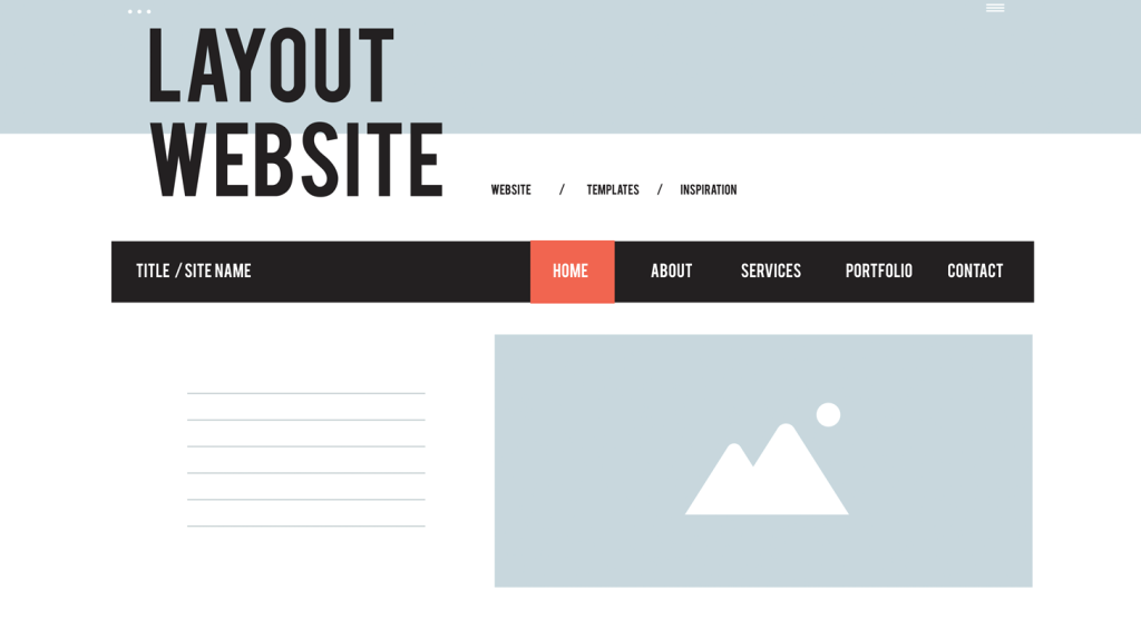
When it comes to designing the layout of your website’s navigation, there are a few key considerations that can have a big impact on both the user experience and SEO. First and foremost, you want your navigation to be clear and easy to use, with descriptive labels that accurately represent the content on each page. But beyond that, there are a number of specific design choices that can help optimize your navigation for both users and search engines.
One important consideration is the placement of your navigation bar on the page. Most websites opt for a horizontal navigation bar across the top of the page, as this is what users have come to expect from years of web browsing. However, depending on the layout of your site, a vertical navigation bar along the left-hand side may work better from both an aesthetic and usability perspective. Ultimately, the key is to choose a placement that works well with your overall design without sacrificing ease of use.
Another important consideration is the use of dropdown menus within your navigation structure. While these can be useful for organizing subcategories or related pages, they can also present some drawbacks from an SEO perspective. Specifically, Google has indicated in the past that some types of dropdown menus can be difficult for their crawlers to read, which may hurt your site’s ranking. If you do decide to include dropdowns in your navigation, be sure to keep them simple and easy to navigate.
Similarly, you may be tempted to include additional design elements within your navigation bar such as icons or images. While these can certainly add visual interest and make your site stand out, it’s important not to go overboard – too many design elements can actually distract from the main goal of helping users find their way around your site.
Think of your website’s navigation as a map – just as you wouldn’t want a map cluttered with extraneous details that make it difficult to read, you don’t want your navigation bar to be overly complex. Instead, focus on simplicity and clarity, and use visual cues like color or bolding to highlight key sections of your menu.
Of course, there are many other factors to consider when designing your website’s navigation structure. From the fonts you choose to the colors you incorporate, every decision can impact the overall user experience. By taking the time to carefully design and optimize your site’s navigation layout, you’ll create an intuitive and user-friendly experience that encourages visitors to stick around and explore your content further.
- When designing the navigation layout for your website, it’s important to prioritize simplicity and clarity while also considering specific design choices that can optimize the user experience and SEO. This includes choosing a placement that works well with your overall design and using dropdown menus sparingly and thoughtfully. While icons and images can add visual interest, it’s important not to overdo it and distract from the main goal of helping users find their way around your site. Ultimately, an intuitive and user-friendly navigation structure can encourage visitors to stay on your site longer and explore your content further.
Mobile and Desktop Considerations

These days, more and more users are accessing websites from mobile devices like smartphones and tablets. This means that optimizing your navigation structure for mobile is just as important as getting it right for desktop users. When crafting your website’s navigation, there are a few specific considerations to keep in mind to ensure that it looks and works great on all devices.
One key consideration is the use of a “hamburger” menu for mobile devices. This icon – which consists of three stacked horizontal bars – has become the standard way of presenting navigation menus on small screens. However, it’s important not to rely too heavily on this icon – recent studies have shown that some users may not be familiar with it, particularly older users who are less tech-savvy.
Another important factor is the size of your buttons or links within the menu. On a desktop screen, larger buttons may feel overwhelming or cluttered; but on a mobile device with a smaller screen, larger links can be easier to tap accurately without accidentally clicking on adjacent links by mistake.
At the same time, you don’t want to sacrifice usability for aesthetics – avoid using images or design elements that take up too much space and make it difficult to navigate the menu.
Think of your mobile navigation as a streamlined version of your desktop navigation – you want to maintain the same basic structure and labeling, but with simpler and more user-friendly design elements that work better on a smaller screen.
By honing in on the unique considerations of mobile navigation, you’ll be able to create a seamless experience for users no matter how they’re accessing your website. With careful attention to detail and an eye towards usability and simplicity, you can craft a navigation system that meets the needs of both users and search engines.
Implementing and Testing Navigation Links
Once you have designed an SEO-friendly navigation structure, the next step is implementing it on your website. It’s important to ensure that every link works as intended and that users can find the information they need without any hassle. Here are some steps to help you implement and test your navigation links:
Begin by double-checking all the links in your navigation menu. Make sure each link points to the right page and that there are no broken or missing links. If any of your pages have been moved or deleted, redirect the old URLs to new ones using 301 redirects.
Once your links are working correctly, check for accessibility issues. Ensure that all your links are visible and readable to everyone, including users with disabilities who may be using assistive technology like screen readers. Use descriptive labels for each link that accurately represent the content on the linked page.
While it’s essential to provide accurate descriptions for each link, avoid overloading your menu with too much text. Too many words in a navigation label are not only visually unappealing but can also make it harder for users to scan through your menu efficiently.
Think of navigation labels like street signs for drivers. Just as a driver needs clear and concise road signs to get where they need to go, users depend on well-labeled links to navigate your site effectively.
Once you’re confident that your navigation system is accessible and comprehensible, carry out A/B testing on different versions of your menu. Test which configurations perform best when it comes to page views, bounce rates, click-through rates (CTRs), and conversion rates.
Ensuring Visibility and Readability

To ensure maximum visibility of your navigation system, prioritize placing it in an easy-to-find location across all devices – desktops, tablets, and mobiles. It should stand out and be consistent throughout all pages of your website.
When you design your navigation, consider the font sizes and formatting so that it will be easily readable to everyone. Avoid using fancy fonts or too-small sizes, instead opt for easy-to-read fonts that are legible even on smaller screens.
Another running theme in website design is simplicity, and this is true for navigation menus too. Research has shown that users prefer clear interfaces that make navigating a site effortless. Use a simple menu design with streamlined options to make it easy for users to find what they’re looking for without getting overwhelmed or lost.
Clear navigation is like a flashlight illuminating the path forward. If the flashlight beam is too narrow, it might not show the whole route; if the beam was too wide, it might become hard to focus on a specific point.
A common mistake when designing a navigation system is providing too many clickable links, which could harm SEO by diluting link equity. Keeping submenu items minimal will help search engines navigate your site effectively rather than directing them into tangential content.
Overall, ensuring visibility and readability for your website’s navigational structure goes beyond enhancing UX. It greatly improves user engagement and satisfaction, both of which can indirectly boost the site’s ranking performance on search engines.
Finally, take user feedback seriously and keep optimizing your navigation system based on feedback received, testing results and data analysis. Always strive for excellence and never stop iterating for the best experience possible.
Responses to Common Questions
What impact does mobile responsiveness have on the effectiveness of SEO-friendly navigation?
Mobile responsiveness has a significant impact on the effectiveness of SEO-friendly navigation. With the increasing use of mobile devices for browsing, search engines prioritize mobile-friendly websites in their search results. A responsive design ensures your website looks and functions flawlessly on all devices, which ranks it higher in the SEO performance.
According to a study by Google, 62% of smartphone users are unlikely to return to a website that is not mobile-friendly. Additionally, 52% of users will leave a site if it takes more than 3 seconds to load on their device.
By implementing responsive design, you provide an ideal user experience that keeps visitors engaged with your website and increases the chances of sharing and linking your content. The easier a website is to use and navigate, the better it performs in search engine results.
Therefore, creating an SEO-friendly navigation system that is also mobile-responsive can significantly improve your overall SEO performance and user engagement metrics.
How can a website owner determine if their current navigation is hindering their site’s SEO performance?
One of the most effective ways to determine if your current navigation is hindering your site’s SEO performance is to analyze your website’s analytics data. Look out for metrics such as bounce rates, exit rates, and time on page. If visitors are leaving your site after viewing only one page or spending a short amount of time on it, it could be a sign that they’re having difficulty navigating your website.
Another way to assess the effectiveness of your navigation is to conduct user testing. You can ask participants to try and find particular pages on your website without any assistance, take note of whether they manage to do so quickly and easily, how many clicks it takes them to get there and any comments they have about the process. This can uncover some navigational problems in seconds.
Lastly, you can consider the best practices for navigation design. For example, using clear text labels for menu items, creating logical hierarchy structure, ensuring easy access on mobile devices, and placing primary links prominently can all help make your website more navigable.
Research indicates that up to 50% of visitors leave websites within the first few seconds when they have trouble accessing information as quickly and effectively as possible (Adobe). Furthermore, a survey conducted by HubSpot found that close to 76% of respondents cited ease of use as the number one factor contributing to a website’s SEO-friendliness.
In conclusion, focusing on SEO-friendly navigation will not only improve your website’s search engine ranking but also enhance its overall usability and user experience.
What are the most important elements to consider when designing SEO-friendly navigation?
When designing SEO-friendly navigation, some elements that must be considered are:
1. Clear and descriptive labels: The labels used in the navigation menu should clearly describe the content of the pages they link to. This helps users quickly understand what they can expect from each page and search engines to understand the semantic context of your website.
2. Logical hierarchy: Arranging your pages in a logical hierarchy ensures that visitors can easily find what they’re looking for. It also helps search engine crawlers to understand the relationships between pages and prioritize them accordingly.
3. Consistency: Consistent navigation makes it easier for users to navigate through your site which can ultimately lead to higher engagement and conversion rates. Furthermore, inconsistency in navigation can negatively affect your SEO efforts, as search engine bots may struggle to index your site efficiently.
4. Mobile responsiveness: People access websites using mobile devices more than ever before, so designing responsive navigation is crucial. A study by Google revealed that 67% of mobile users say that they are more likely to buy from a mobile-friendly website.
5. Speed: A fast-loading website results in improved user satisfaction and better search engine rankings since speed is a ranking factor. A recent report suggests that optimal website load time should be no slower than 3 seconds.
In conclusion, designing SEO-friendly navigation involves optimizing your website for both user experience and search engines. By ensuring clear and descriptive labels, logical hierarchy, consistency, mobile responsiveness, and speed, you will improve your site’s usability and search engine visibility.
How do search engines like Google evaluate website navigation for SEO purposes?
Great question! When it comes to SEO, search engines evaluate website navigation by looking at a few key factors:
1. Structure: Search engines like Google look for clear and logical site structures that help users easily navigate through the website. This includes having a main navigation menu that is easy to find and use, as well as submenus and dropdowns that are organized in a way that makes sense.
2. Usability: In addition to a clear structure, search engines also evaluate website navigation based on its usability. This means that the links and buttons used for navigation should be large enough to click on easily on both desktop and mobile devices, and they should be placed in locations where users will expect to find them.
3. User engagement: Finally, search engines like Google also use user engagement metrics to evaluate website navigation for SEO purposes. This includes things like bounce rate (how quickly users leave your website after arriving), time on site (how long users stay on your site), and pages per session (how many pages users visit during each session). If your website has a high bounce rate or low time on site, this could indicate that your navigation is confusing or difficult for users to use.
Overall, having a clear and user-friendly website navigation is essential for SEO success. According to a study conducted by Nielsen Norman Group, “users spend an average of 57% of their time above the fold.” Therefore, having optimized headers and links upon initial landing is crucial for capturing the attention of potential customers. Additionally, external linking on websites improve not only how Google crawls the page but establish authority within that specific sector or market niche. By focusing on these key factors when designing your website’s navigation, you’ll be sure to set yourself up for SEO success!
Are there any common mistakes that should be avoided when creating SEO-friendly navigation?
Yes, there are some common mistakes that should be avoided when creating SEO-friendly navigation. Some of them includes:
1. Complicated Navigation: Website navigation that contains too many options or complex features can confuse users and harm the site’s search engine optimization (SEO). According to a survey by HubSpot, almost 76% of website visitors value ease of use in website design above all else.
2. Overuse of Dropdown Menus: While dropdown menus can simplify website navigation, excessive use can harm navigability and make it difficult for search engines to crawl your site. Excessive dropdown menus can also lead to loading problems, which could ultimately affect your Google rankings.
3. Not Having a Mobile-Friendly Navigation: As website traffic continues to shift away from desktops and toward mobile devices, having a mobile-friendly interface is critical for SEO. Google now considers mobile-friendliness as a factor in search rankings.
4. Improper Use of Anchor Text: Anchor text refers to the clickable text in a hyperlink on your website. It should provide context about where the link will lead when clicked. Using generic phrases like “click here” instead of descriptive anchor text could harm your search engine rankings.
In conclusion, while there are several factors that determine your website’s SEO ranking, implementing sound navigational elements is one of the most critical. By avoiding these common mistakes, your website will be more accessible and easy to navigate – thus improving its SEO performance.
SEO-friendly navigation goes hand in hand with SEO-friendly content. If you’re looking to quickly and efficiently create search engine friendly content for your website or blog, check out On-Page.ai, as it’s loaded with AI-driven features like the Stealth Writer and Rewriter that will help you simplify your content creation process.